Transforming Water Entrepreneurship: A Cewas Branding Success Story
Introduction
Cewas, originating as a specialized water and sanitation entrepreneurship program in the idyllic city of Willisau, Switzerland, has organically expanded into a global powerhouse operating in over 40 countries and partnering with more than 300 entrepreneurs. Despite its unrivaled industry services, cewas's corporate identity inadequately reflected its success and importance.
The Objective
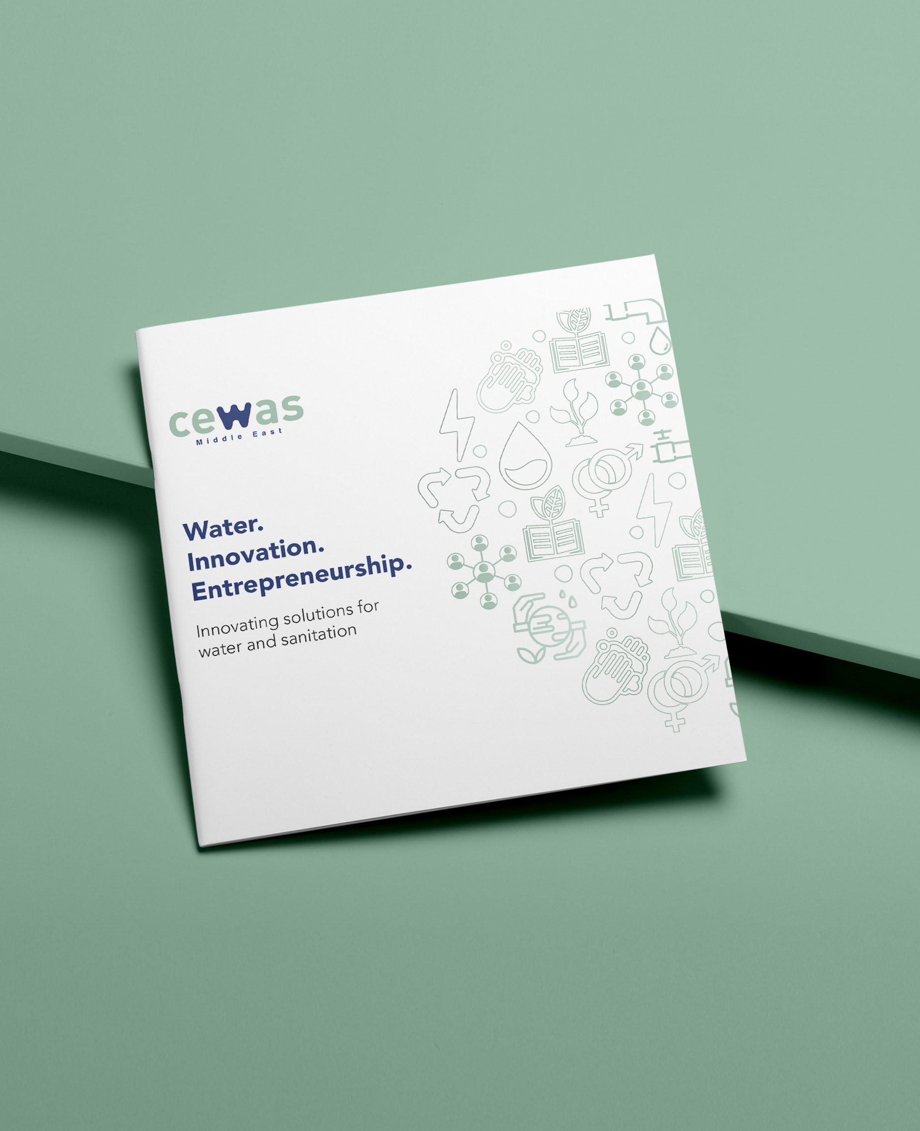
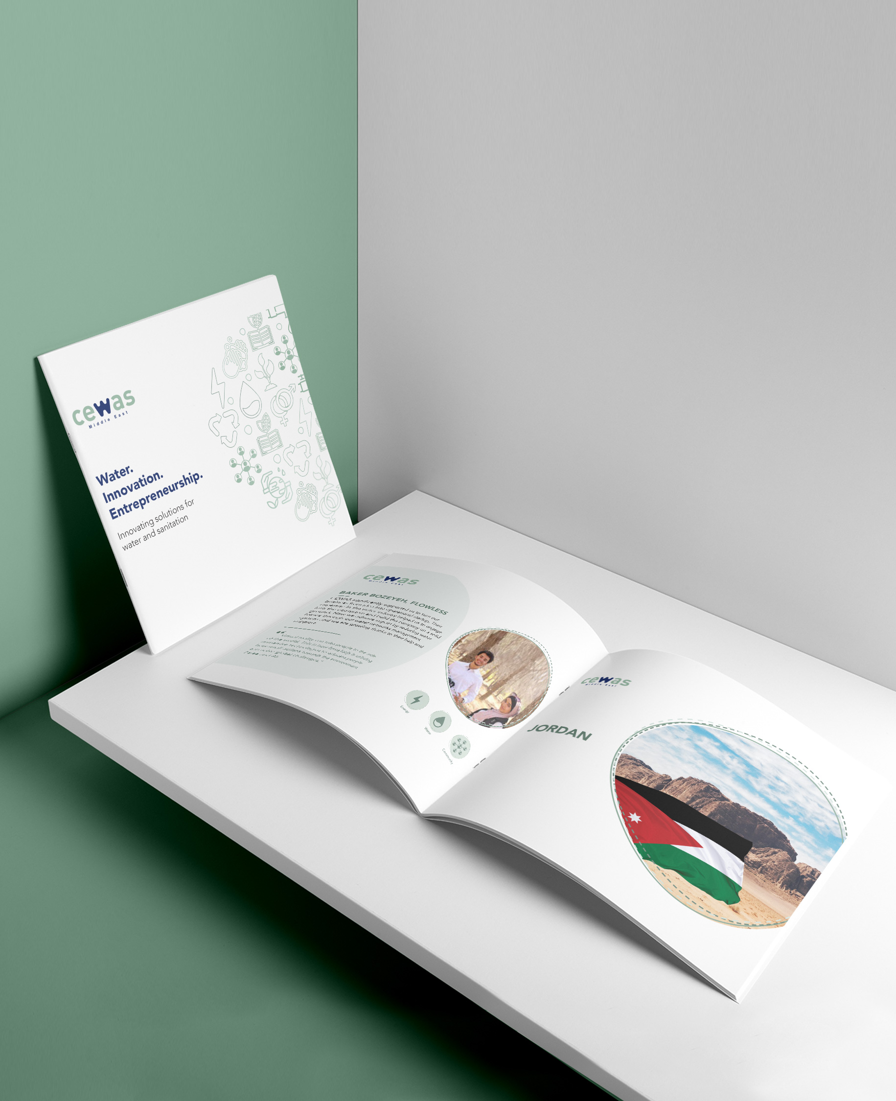
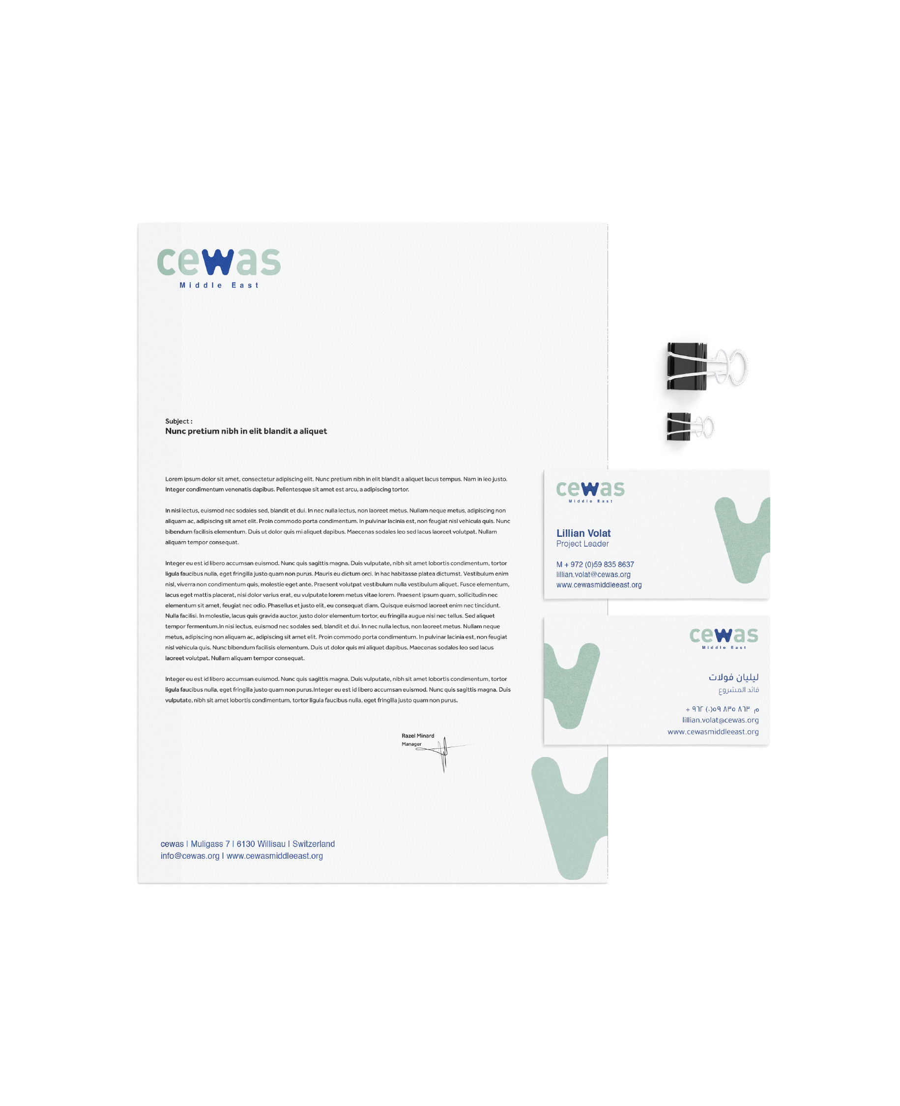
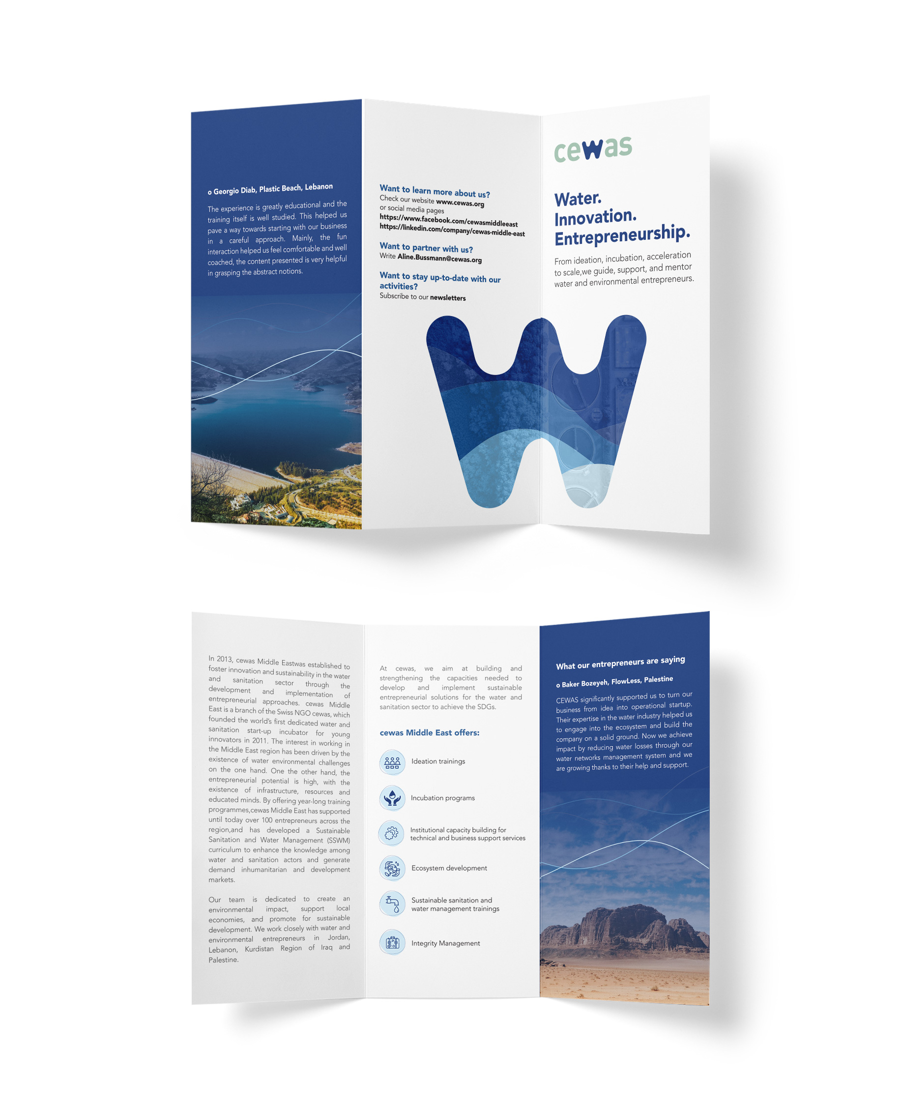
Our collaboration with cewas aimed to develop an impactful brand that captured the essence of the company's key strengths: ecosystem development, knowledge and training, and entrepreneurship support. Our goal was to present a cohesive and compelling brand identity that effectively communicated the range of cewas's services across all touchpoints.
The Strategy
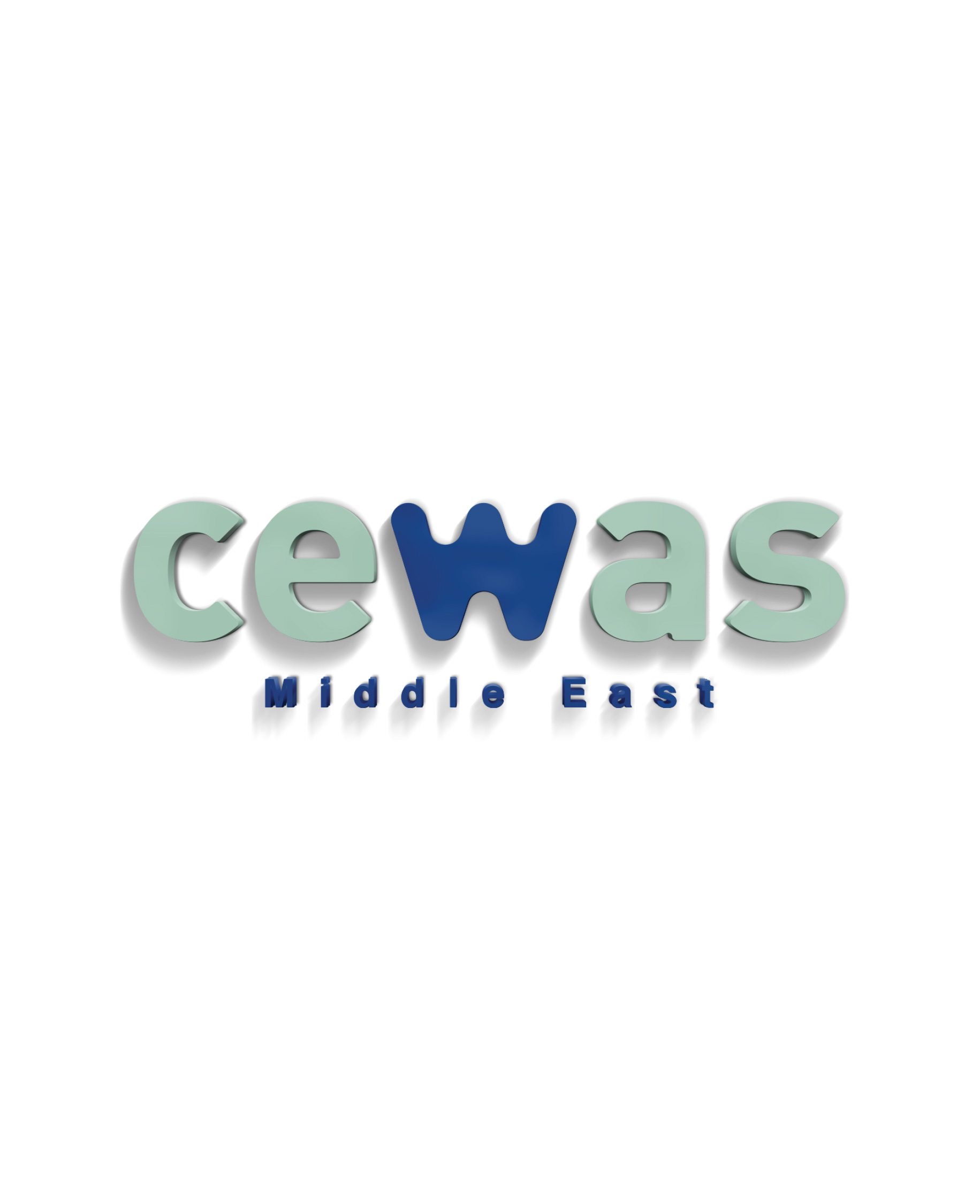
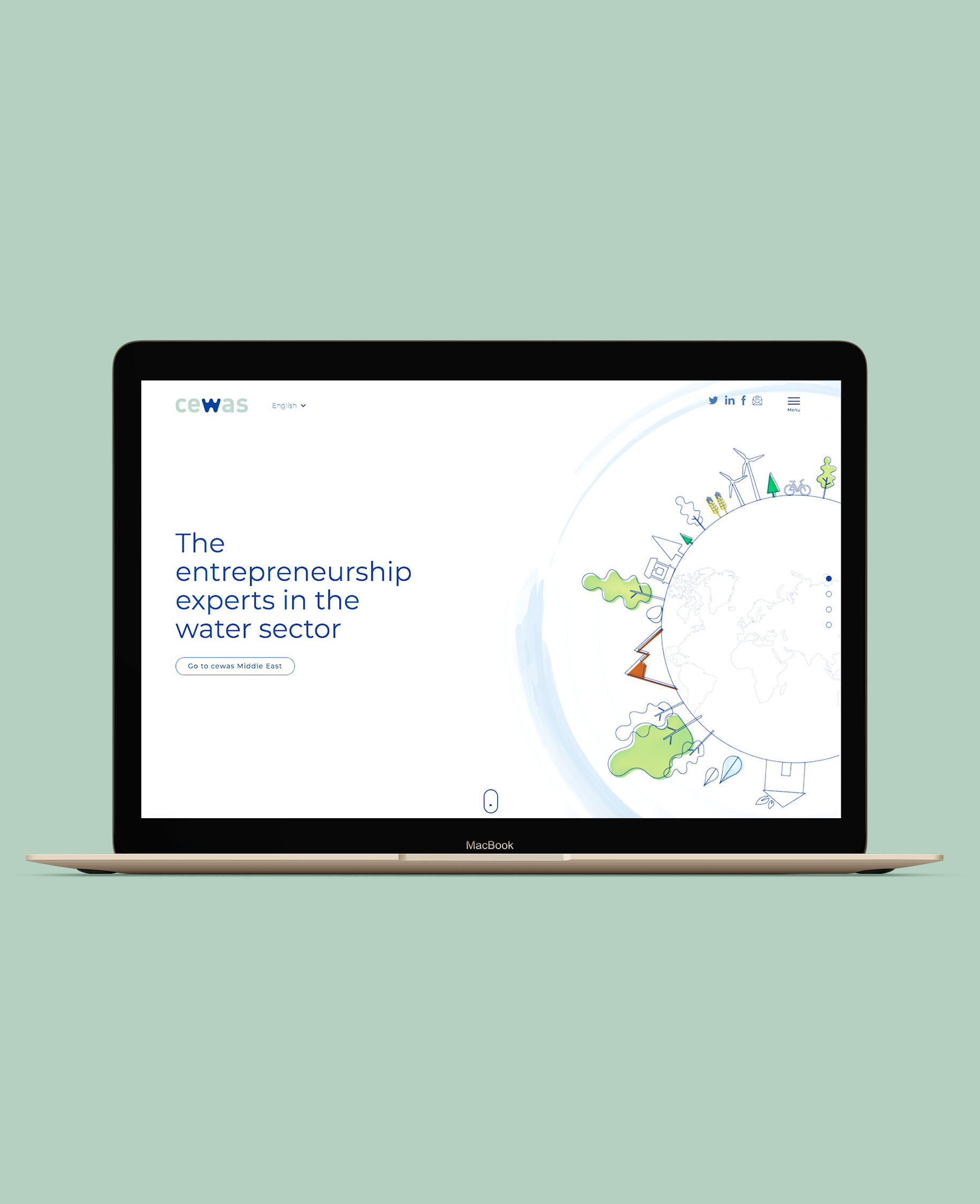
We began by focusing on water, cewas's primary area of expertise, while designing the lettermark logo. To reflect the fluidity of water, we rounded the corners of the "W" and set it apart from the other letters. We chose soft green to signify life, renewal, nature, energy, and the environment, while dark blue was used for the "W" to convey cewas's expertise and evoke feelings of trust, dependability, and professionalism. We emphasized minimalistic colors, bold typography, streamlined elements, and a cohesive brand narrative to align with cewas's identity. Our partnership extended to the development of a new website, which showcased the brand's updated look, feel, and voice online.
The Impact
A successful brand is built upon a strong culture, comprised of individuals who comprehend how their actions shape the brand and influence its audience. The rebranding of cewas was more than just a visual identity and marketing overhaul; it served as a catalyst for redefining the landscape of water entrepreneurship and promoting positive social and environmental change.
cewas.org

